Datamap dashboard
Overview
Datamap is a tool that integrates all the sources of data within an organization, contains information on the various organizational data systems and enables users to obtain an extensive understanding of the organizational data by tracking how it is created and classified, where and how it is stored and how the data moves from one system to another.
The Datamap contains extensive information on each system/subsystem/tables/project/entity such as the document types of existents within the it, whether it contains sensitive data, the data sources, the applicable retention labels, associated risks and their controls to name a few.
The information under the different systems of the Datamap can also be edited, updated, and deleted depending on input from various other sources such as the responses from surveys, DSARs, retention uploads, and so forth.
To access the Datamap module, follow these steps:
- Log in to your Data Governance Tool account.
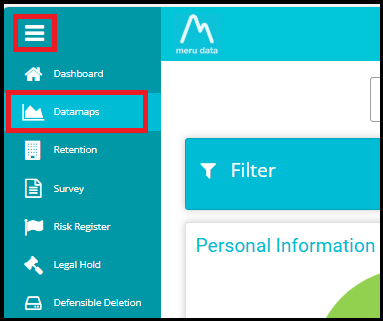
- Once logged in, open the hamburger menu present on the top left of your screen, click on Datamaps.
- From the Datamap homepage, you can navigate to, view, and use its various features.
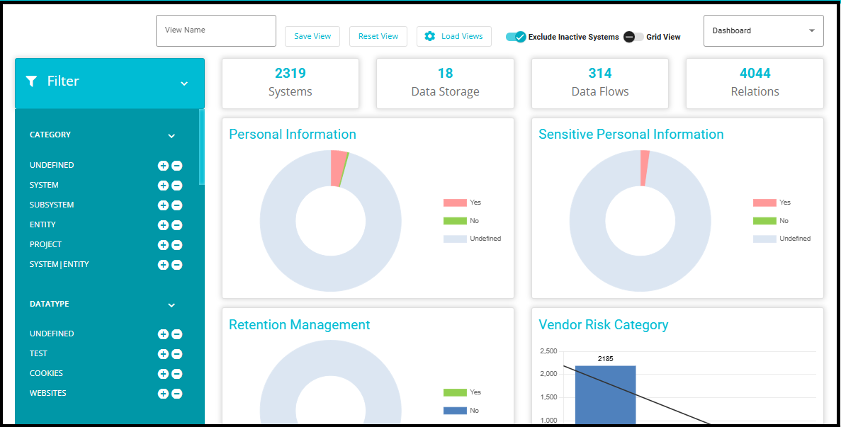
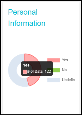
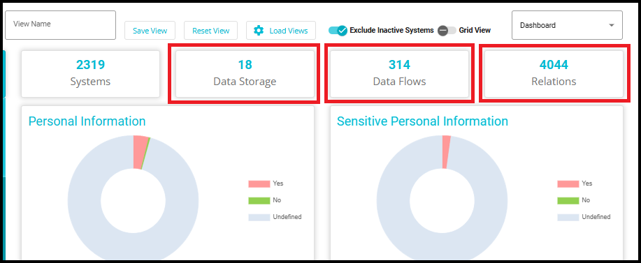
The Personal Information graph visualizes the distribution and volume of personal data across the DataMap systems, providing insights into where personal information is stored and processed.
The Sensitive Personal Information graph highlights the presence of sensitive personal data within the DataMap systems, enabling effective monitoring and governance of high-risk data categories.
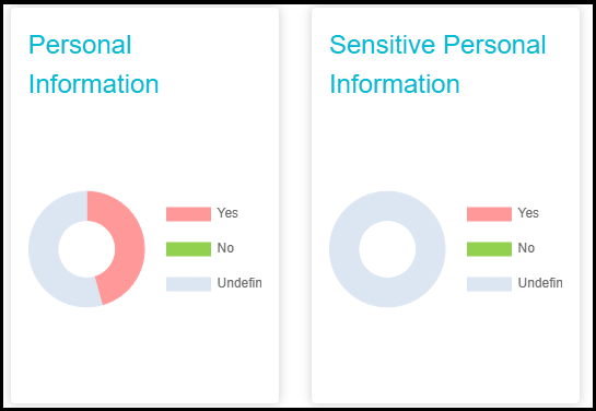
- Hovering over the graph provides a detailed view of the exact number of personal and sensitive personal data records mapped within the systems. This interactive feature enables users to quickly assess data distribution and identify areas requiring closer monitoring or compliance actions.
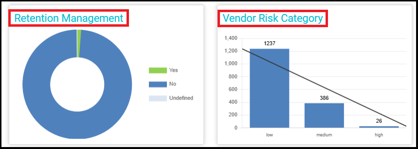
The Retention Management graph illustrates the DataMaps with current configurations designed to ensure effective retention management. This graph provides a comprehensive view of how data is retained in accordance with retention policies, helping to streamline data management and compliance processes.
The Vendor Risk Category graph categorizes vendors based on defined risk levels. This helps to evaluate and manage the potential risks associated with each vendor, enabling informed decision-making and proactive risk mitigation.
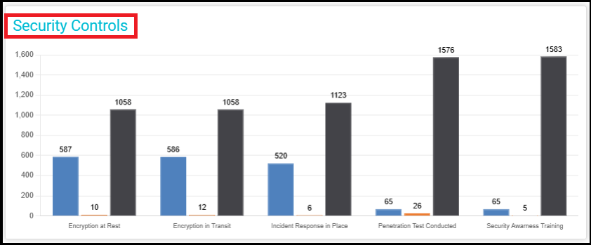
- The Security Controls graph in the DataMaps section provides an overview of implemented security measures across various data assets. It displays key security controls such as encryption (at rest and in transit), incident response readiness, penetration testing, and security awareness training. The graph highlights the number of data assets where each control is applied, aiding in compliance monitoring and risk assessment within the data governance framework.
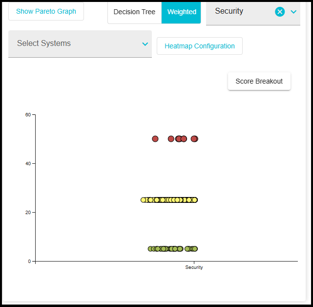
- The Weighted Security Score graph in the DataMaps section provides a visual representation of security scores across different systems. The graph categorizes systems based on their security posture, using a weighted scoring model to highlight areas of concern. Data points are color-coded, typically indicating risk levels (e.g., green for low risk, yellow for moderate risk, and red for high risk). This visualization helps in identifying security vulnerabilities, prioritizing remediation efforts, and enhancing overall data protection strategies. For more details, please go through the Heatmap.docx
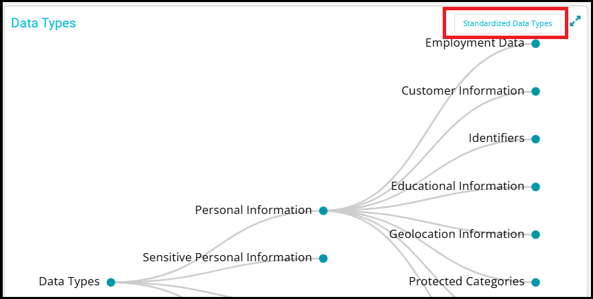
- The Data Types graph in the DataMaps section provides a structured visualization of various data types within the system. It displays how data types are categorized and connected, helping users understand the relationships between different data elements. This representation aids in standardization efforts, ensuring consistency in data classification and governance. Users can leverage this view to track data types, enforce policies, and streamline data management practices.
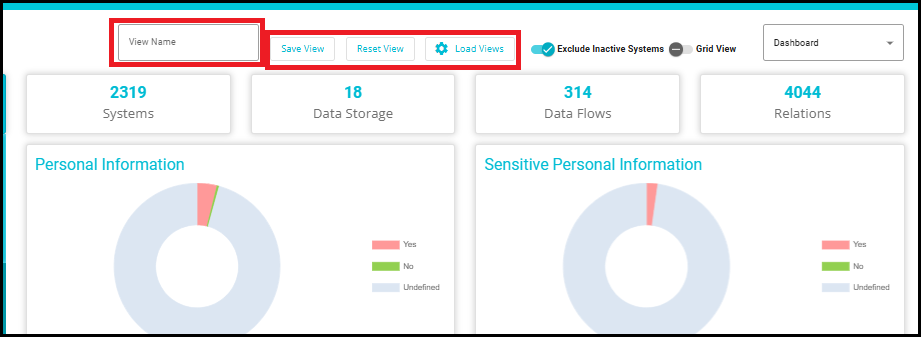
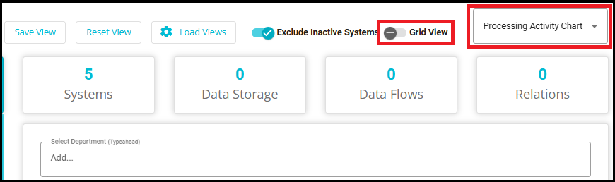
- Exclude Inactive Systems: By enabling this toggle, you may choose to include or exclude systems that have been inactive.
Views: Designed to help users save their filter settings, advanced filters, column sorting, and other dashboard configurations.
Instead of entering the same query or filter conditions every time, users can save these settings as a View and easily load them later.
Creating and Managing Views
- Create a New View
Enter a specific view name in the View Name box at the top of the dashboard.
Click Save View to save your current dashboard configuration under the entered name.
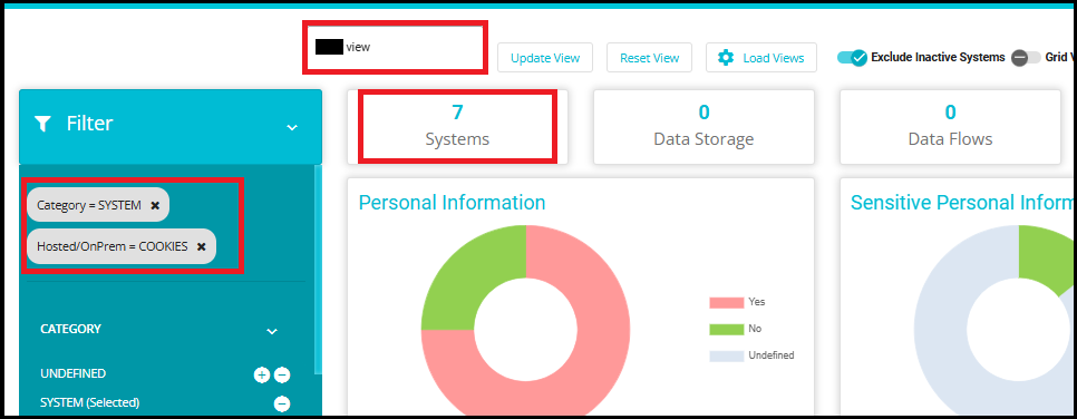
- Resetting a View
- To clear the current settings and revert to the default view, click Reset View.
- Loading Existing Views
Click Load Views to open a dropdown menu listing all previously saved views.
Select any view from the dropdown to load its configuration onto your dashboard.
4. Updating an Existing View
Once a view is loaded, you can make changes to its configuration.
Click Update View to update the existing view with the new settings.

For example, if you apply filters (such as "Category = SYSTEM" and "Hosted/OnPrem = COOKIES") and sort columns to display only certain systems, you can save this configuration as a View. When you load this View, the dashboard will instantly show the filtered data without needing to reapply the filters.
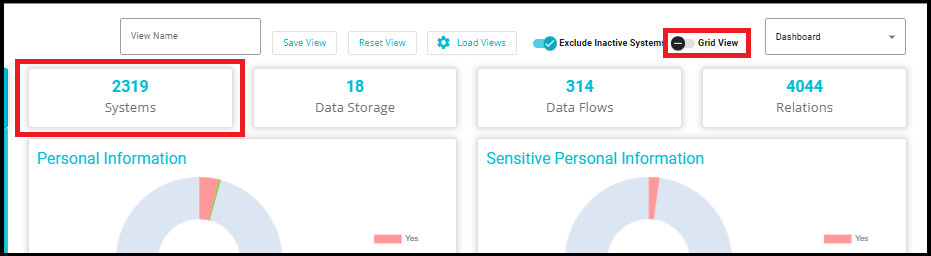
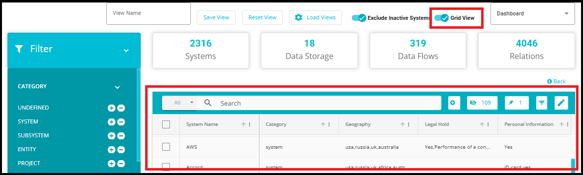
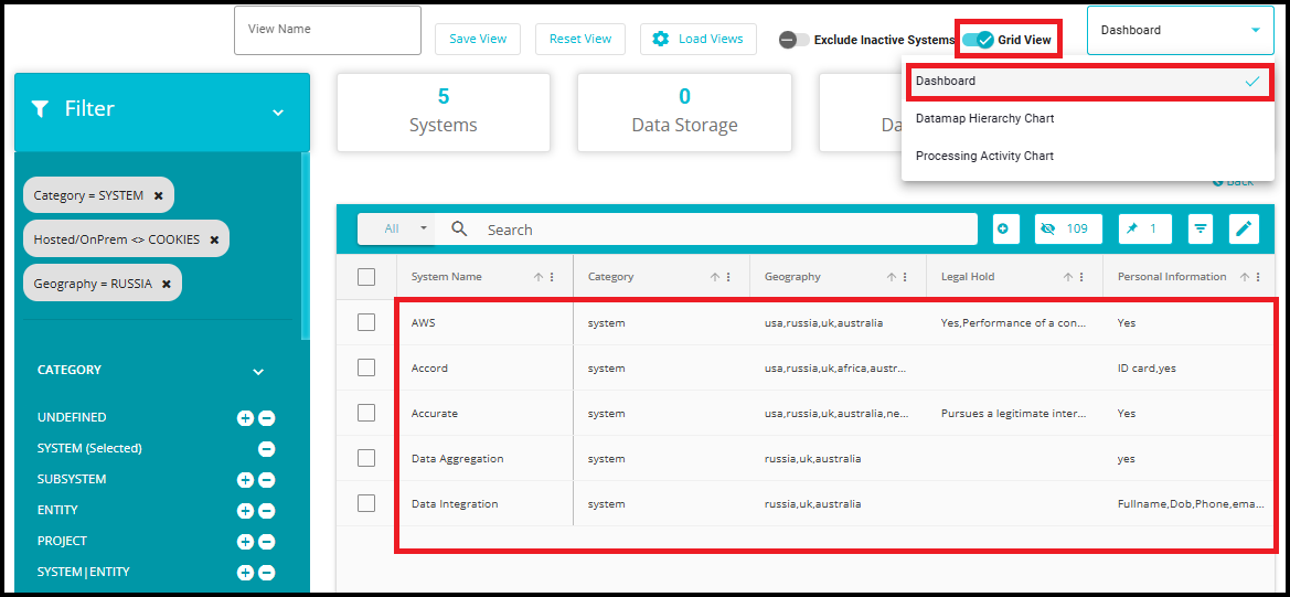
- Click the "Grid View" toggle to switch from the current view to the grid layout. Or simply click on "Systems", which will directly take you to the same Grid View layout.
- The Datamaps page contains the table of all the organizational data systems/subsystems/projects/entities and their details.
17.Data Storage
These represent the distinct data repositories or databases used within the system.
Important for understanding where data resides and how it's managed.
18.Data Flows
These are the pathways through which data moves between systems, applications, or components.
Useful for identifying potential bottlenecks, security risks, or optimization opportunities. For more information related to data flows, please refer to the Datamap Flow.docx
19.Relations
Represents the connections or associations between different entities (e.g., tables, objects, services).
Critical for understanding dependencies and impact analysis during changes. For more information related to Relations, please refer to the Relation Mapping.docx
- In the Filter Column on the left, you can choose to view or hide Datamap features of your choice.
The purpose of filters is to focus on systems that meet specific conditions---such as a particular location or specific system attributes. By applying filters, we can:
Identify how many systems exist in a particular geography.
View systems that contain specific data types.
Narrow down systems belonging to a particular category.
Concentrate only on systems that meet all selected criteria, making analysis easier and more accurate.
The filters in the left Filter panel apply consistently across the entire Datamap module, including the Dashboard tiles and charts, the Grid View, the Hierarchy view, and the Processing Activity Graph.
When you adjust filters (e.g., Category = System, Hosted/OnPrem ≠ Cookies, Geography = Russia), the counts and visuals across all views update to reflect the same filtered dataset.
Example: The total systems are reduced from 2319 to 5.
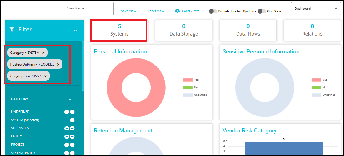
- When you switch the Grid View toggle, the grid also displays exactly these 5 systems, confirming that it reflects the same global filters applied on the Dashboard.
 {width="6.5in" height="3.0in"}
- You can toggle between the Processing Activity Chart and Datamap Hierarchy Chart directly from the Dashboard using the dropdown menu.
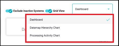
- Datamap Hierarchy Chart displays Datamap in a Hierarchical form.
Relations built between two datamaps will be shown as a Graph on the Datamap Hierarchy Chart option.
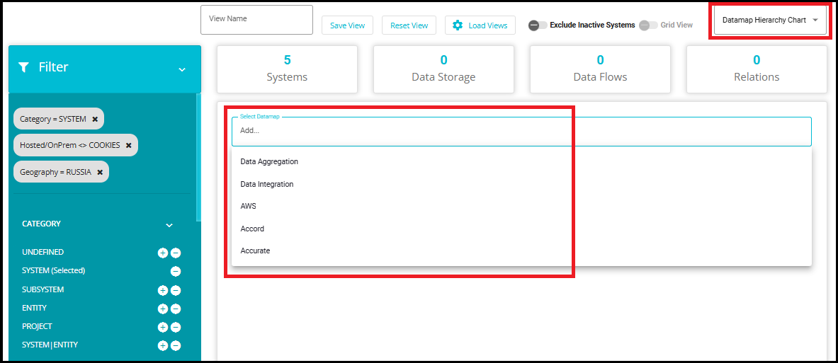
- When we switch to the Datamap Hierarchy Chart, the Select Datamap dropdown will display only the 5 systems that satisfy all the applied filters
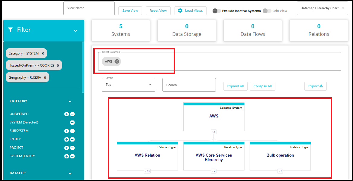
- Selecting a system---for instance, AWS---will display its Datamap Hierarchy Chart, showing the system as the root along with its related entities and relationship types. This view does not change or modify any data; it only provides a hierarchical representation of the already‑filtered system.
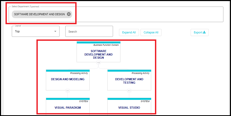
- In the Processing Activity Chart, you will be able to view all Processing Activities along with any details present about them in either Grid form or Hierarchical form depending on which side you enable the toggle.
The Processing Activity Chart visually represents the relationship between business functions, their associated processing activities, and the datamaps involved in those activities. Specifically:
At the top level, it shows each business function within the organization.
Under each business function, it displays how many processing activities are associated with that function.
For each processing activity, it further breaks down how many and which datamaps (systems, subsystems, projects, or entities) are involved.
When you switch to the Processing Activity Chart and select a department from the dropdown, the chart displays only the processing activities linked to systems that satisfy the applied filters.
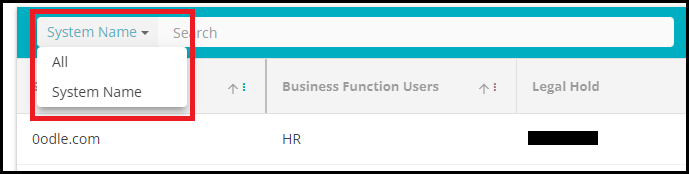
22. Search: The search bar allows you to search for any existing system. Type in the System Name in the space to get the relevant results. The search criteria can also be changed to "All" to get results from any attributes matching the search input.
23. Add: Click on ![]() to configure a new system which will be added to the Datamap.
to configure a new system which will be added to the Datamap.
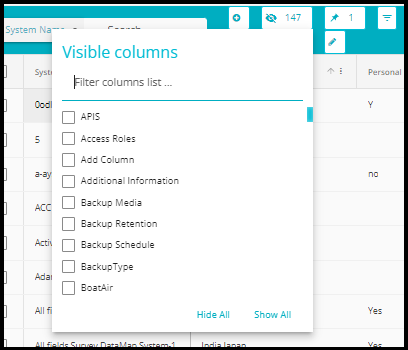
24. Visible Columns: From the drop-down menu that appears on clicking this button, select the columns (System Fields) you want visible on the table. The drop-down menu consists of all the System fields.
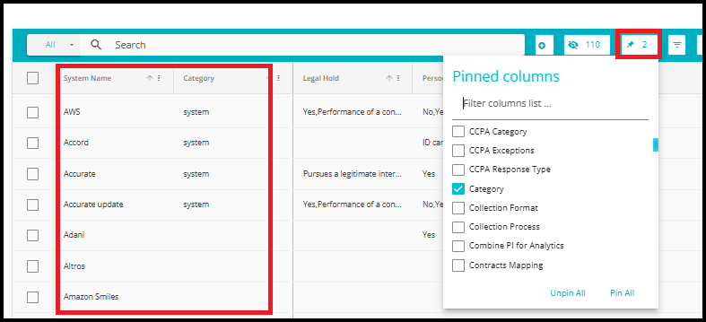
25. Pin: From the drop-down menu that appears by clicking this button  , select the columns you want pinned on the table. The drop-down menu consists of all the System fields. This feature works similarly to the Freeze pane feature. Selected columns will remain pinned to the left side of the grid.
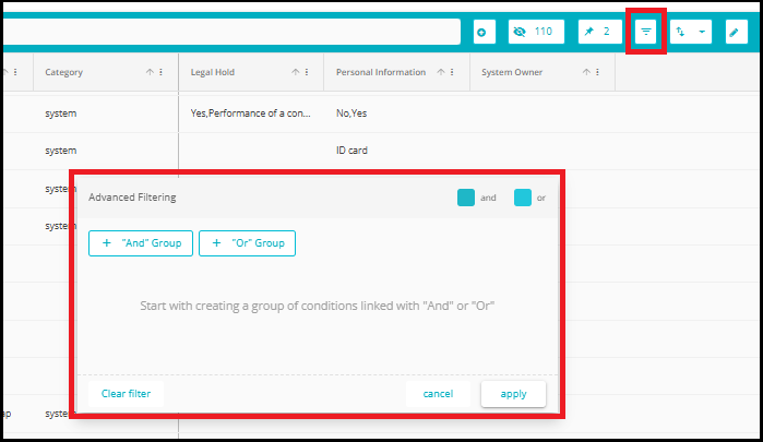
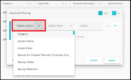
26. Advanced Filtering: This feature can be used to filter results based on multiple conditions. Use the "And" or "Or" criteria to filter results. The information displayed on the grid will change according to the filters applied here.
For Example: To hide specific columns, you can configure the columns to be visible and their contents here.
- Click "And" Group. From the dropdown, select the column.
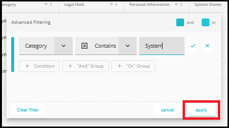
- Select filter to configure based on the contents of the column as displayed in the drop-down.
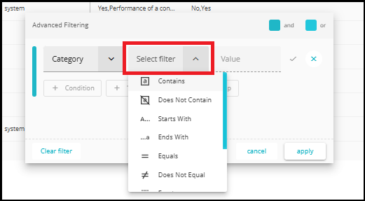
- And enter Value. This is in the case you select Contains, Does Not Contain, Starts With, Ends With and other such filters that might require a value to identify.
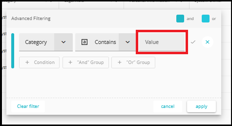
- Once you have completed, click on apply to reflect.
- A similar process is carried out for the Or Group.
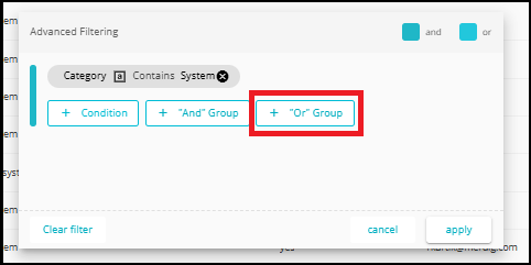
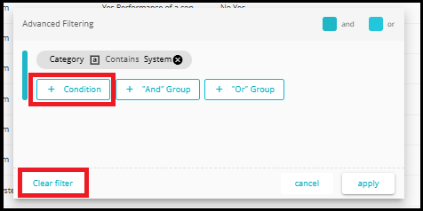
You can add multiple conditions at a time using the '+ Condition' option.
To clear all applied filters, click the 'Clear Filter' button located at the bottom left of the pop-up."
27. Bulk Export: The contents of the table can be exported in an excel or CSV format by clicking this button and selecting the format preference.
For detailed guidance, refer to the BulkExport.docx document.
28. Bulk Update: With this feature, updates and edits can be made to selected System fields of any number of systems at a time.
For detailed guidance, refer to the Datamap Bulk Update.docx document.
29. Bulk Add Relation: Instead of manually linking systems one by one, this tool allows users to select a group of systems in bulk and define how they are related - all in a single operation.
For detailed guidance, refer to the Bulk add relation.docx document.
